Tuesday, 26 April 2011

Evaluation (Content page)

In what ways does your media product use, develop or challenge forms and conventions of real media products?

When researching for content pages, i especially concentrated on 'Vibe' magazine again.
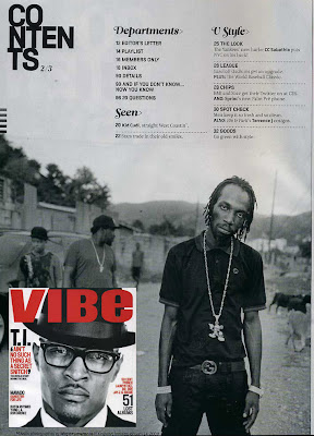

 I partcularly like how the content page is simple, yet is abe to set a type of theme and scene that relates to the genre of the magazine.


I also like how they use single images, and plain backgrounds, and yet they are able to acheive a content page that is eyecatching and interesting.

This is what i tried to do with my own work...


 I used a picture I took of my friend and manipulated it on photoshop add emphasis on his hand. This would be the main focus, as, as an artist this is what 'Chronic Wave' is known for doing. I chose to do it on a lain background, as you wont see the ackground anyways. It also makes the image in a whole look less busy.

To keep in simple, i just added a simple font and a plain, bold colour...this is similar with the magazines i had looked at.

I also played around with the title, to make it looks more playful...


Evaluation (Front cover) Cont...

How did you attract/address your audience?

I also made sure that the person i used for the frontcover was relevent to the audience that i was aiming for. I made sure that the person looked the same age and carried a particular look. In this case, they had to look like a rapper.
 

I also used larger fonts to capture the audiences attention, the font i used was bold and extremely legible. I also added emphasis on some of the title's to make it look playful to the eye, and i also played around with the colour, so that it matches with the clothes he is wearing.

Monday, 25 April 2011

EVALUATION

After producing a final front cover, contents page and double page spread; I will sum it all up in a evaluation about my research, production planning and techniques used when creating them...


FRONT COVER

In what ways does your media product use, develop or challenge forms and conventions of real media products?   


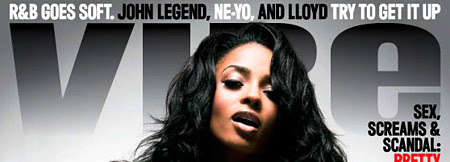
This is my final front cover, as explained before; I've taken inspiration from various magazines; one in particular...this front cover from Vibe...


What I ahve taken from this is the colours used, the front cover has used the colour red, and for my own magazine i have chosen to use the colour purple.

I used another magazine which influenced me to do the design of the title;


I went on photoshop and added a faded effect just as it has done it 'VIBE'. I thought this effect particularly worked well with my title 'RAP IT UP' it makes it seem like the word is 'rising' or going 'up'...
I also added a effect to change the texture of the title, and added it to make it look rough; this displayd the idea of rap being a rough, dirty genre. It also sets the mood of rap once you look at it.


How does your media product represent particular social groups?


This is the image i chose for my front cover as i thought it was very powerful and bolg; it was very 'out there' and thought that it would appeal to the audiences. The person i used was in the same age group as the audience I hope to appeal.
The polarised effect i added to the image adds to the busy lifestyle that rappers go through, it also adds to the 'roughness' of rap...
I am aware that he is infact holding a shoe; you might be think...what has this got to do with rap? In this case, I decided to highlight what rappers rap about in theses days; money, women...sex and drugs. My front cover headline is about 'New style' of rap...i thought this image would intrege the audience and make them want to read on about why he is holding a shoe?...What does this artist rap about? Is it something out the ordinary?

The way that he is dressed is revelent to the way rapper these days dress; the hat. the shirt...the 'swag'?


In this image; rapper Wiz Khalifa shows off his chain; this is something rappers these days do, i thought in a way this relates to the image i chose to use for my front cover...


What kind of media institution might distribute your media product and why?

This type of magazine could be found anywhere where music is present, particularly with teens. For example, in youth clubs...Recording studio's? And ofcourse easy access places such as WHSmith and News agents...


Who would be the audience for your media product?

My main audience for my media product will be for teens who are definately into the genre of rap.


The magazine will also appeal to people in their  20's+ as they could be music producers, scouts or just work music related with the genre of RAP.


A music producer?


How did you attract/address your audience?

This part was particularly easy because I had to basically do things that would attract myself to a magazine. This includes the use of;

-COLOUR
-IMAGE
-CONTENT


For the front cover, i made sure to concentrate on the image and the use of colour, as  this is what attracts me when I buy a magazine. 

Friday, 1 April 2011

CONTENT PAGE

For the content page I took inspiration from 'Vibe' magazine. The photo of Obama and the contents around was simple but effective...


Here is my own version....

You can see some similarities with my content page to the one i took inspiration from. For example, where the list of contents is layed out.
I tbought I'd keep the font simple as it alredy had a background and I couldnt make it look too busy. I still felt this was efectivine and made my content page look organised.


Here I have taken a quote from a possible interview that could be in the magazine; this could act as a teaser for the audience to be intreged and read on to who said it....
I also added the glowing effect around the text to make it noticable, so its the first thing that the audience notices. It also makes the page have some sort of theme, as i had this glowing around the name of the magazine.


Thursday, 31 March 2011

DOUBLE PAGE SPREAD

Just as i mentioned before, I wend along with the plan to get inspiration from this double page spread...


This was my outcome...


I have tried to make 'ChronicWave' in the similar way that 'Jamelia' was created. I added a bit of edge to it by using the style of font.


If you take time to read the article, you will notice the questions that I have taken from previous interviews that I have watched. I also decided to change the colour of the font to blue, so identify the question to the answers...


Similar to other double pages; I have decided to quote the artist, and add a few of them around the page to catch the audiences attention. I had to choose wisely about which quotes to choose in order to some up the interview in a whole.


I am my own inspiration?!!?!?!?!?!??!


Interview?

Before writing my interview, I had watch a few to have an idea of what questions they ask; I wouldn't want to be waffling now...
Although the person i researched is not music artist, he is related to music as a dancer. I chose to watch him because I knew i would have a lot of interest in listening to the whole interview as he is one of my inspirations. So, here it is...


Besides enjoying watching the interview, I was able to pick up on a few subjects that the interviewer asking Brian, and i thought i would include them in my interview, these were;

-How did you get started?
-Who is your inspiration?
-Did you expect to get this far?
-Where do you see yourself in 5 years from now?

And to top it off, since we're on the subject of Brian Puspos..... enjoy a dance video from him (:


Planning and research towards DOUBLE PAGE SPREAD.

I knew i wanted to create a double page spread that included an interview; or else, what else was i going to write about....
Here are a few double page spreads i came across whilst searching for some inspiration;


This particular front cover got to my attention because of the big bold 'USA', i thought it was clever how the editor made this highlighting the central image. There is a minimal use of colour, which keeps in simple yet works extremely well.


With this, I like how they used the quote as the title, although there is minimal writing, the quote that was chosen would have summarised the whole article. I also like how the photo overlaps the page, creating an edgy look for the whole double page.


This was the double page spread that i thought of using as inspiration for my final one; I like how the editor has used the range on photo's and the layout of the text to all fit in place, with out it looking too busy. The use of colours all flowed together, and the big 'JAMELIA' automatically catches the readers attention to realise who the article is about.